
공부 기록
[코드분석] 데이터 시각화(1) 본문
catagory & numeric data
코드 출처 : www.kaggle.com/joshuaswords/predicting-a-stroke-99
Predicting a Stroke (99%)
Explore and run machine learning code with Kaggle Notebooks | Using data from Stroke Prediction Dataset
www.kaggle.com
fig = plt.figure(figsize=(12, 12), facecolor='#f6f6f6')
gs = fig.add_gridspec(4, 3)
gs.update(wspace=0.1, hspace=0.4)
background_color = "#f6f6f6"
run_no = 0
for row in range(0, 1):
for col in range(0, 3):
locals()["ax"+str(run_no)] = fig.add_subplot(gs[row, col])
locals()["ax"+str(run_no)].set_facecolor(background_color)
locals()["ax"+str(run_no)].tick_params(axis='y', left=False)
locals()["ax"+str(run_no)].get_yaxis().set_visible(False)
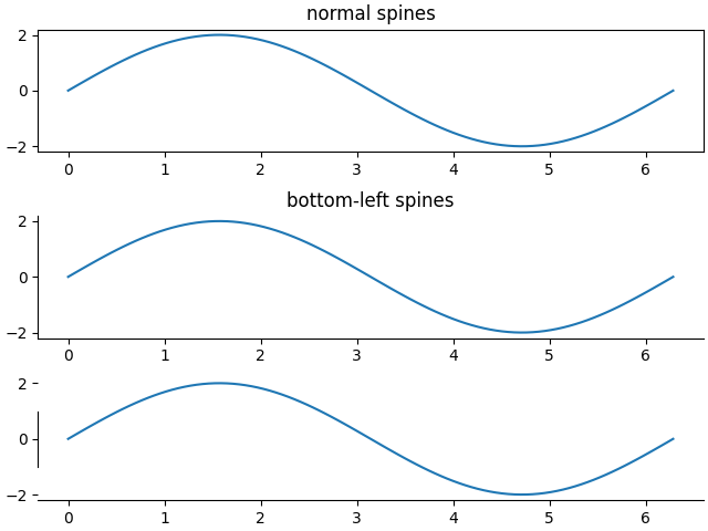
for s in ["top","right","left"]:
locals()["ax"+str(run_no)].spines[s].set_visible(False)
run_no += 1
run_no = 0
for variable in conts:
sns.kdeplot(df[variable] ,ax=locals()["ax"+str(run_no)], color='#ff6f61', shade=True, linewidth=1.5, alpha=0.9, zorder=3, legend=False)
locals()["ax"+str(run_no)].grid(which='major', axis='x', zorder=0, color='gray', linestyle=':', dashes=(1,5))
locals()["ax"+str(run_no)].set_xlabel(variable)
run_no += 1
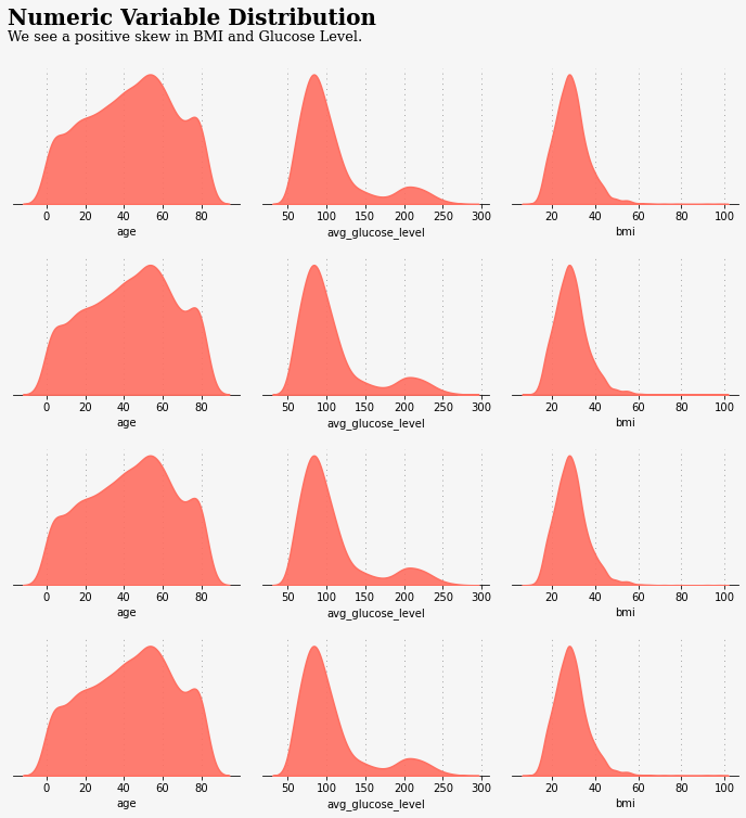
ax0.text(-20, 0.022, 'Numeric Variable Distribution', fontsize=20, fontweight='bold', fontfamily='serif')
ax0.text(-20, 0.02, 'We see a positive skew in BMI and Glucose Level.', fontsize=13, fontweight='light', fontfamily='serif')
#ax15.get_xaxis().set_visible(False)
plt.show()- figure()
- 그림을 그리는 캠퍼스로 생각할 수 있다.
- 하나의 figure에는 여러 개의 plot이 들어갈 수 있다. //plot는 하나의 차트에 해당한다.
| 매개 변수 | default 값 | 들어갈 수 있는 값 | 설명 |
| num | int 또는 str | 그림의 고유 식별자 | |
| figsize | [6.4, 4.8] | [float, float] | figsize = [너비, 높이] |
| DPI | 100.0 | float | 그림의 해상도 |
| facecolor | white | 배경색 | |
| edgecolor | white | 테두리 색상 | |
| frameon | True | bool | False이면 그림의 프레임 그리기 억제 |
| FigureClass | 선택적으로 사용자 지정 Figure 인스턴스 사용 | ||
| clear | False | bool | True이면 이미 있던 그림 지워짐 |
| tight_layout | False | bool 또는 DICT | |
| constrained_layout | False | bool |
- add_gridspec( nrows = 1, ncols = 1)
- nrows는 int형 값이 들어가며 default 값은 1이다. grid의 행수를 결정한다.
- ncols는 int형 값이 들어가며 defautl 값은 1이다. grid의 열수를 결정한다.
- grid는 격자, 눈금을 의미한다.
- 위 코드에서 ncols < 3이면 error가 발생한다.

- update(wspace = 0.1, hspace = 0.4)
- wspace는 너비를 hspace는 높이를 설정


위에 내용 기반으로 코드를 분석해보면 아래와 같다.
fig = plt.figure(figsize=(12, 12), facecolor='#f6f6f6')
gs = fig.add_gridspec(4, 3)
gs.update(wspace=0.1, hspace=0.4)
fig라는 변수에 12*12크기에 배경색 f6f6f6인 캠퍼스를 생성하여 저장한다.
gs에 만들어진 캠퍼스에 행 4개 열 3개짜리 그림그려질 공간을 추가해서 저장한다.
그리고 그 gs에 그려질 그림이 그려질 공간들간의 너비 여백은 0.1 높이 여백은 0.4로한다.
- local()[]
추측하기로는 []안에 들어간 것의 이름으로 지역변수를 만들어 주는 것 같다.

- start는 int형으로 시작값을 의미한다.
- stop은 끝나는 지점으로 포함되지 않는다. ex) range(0,1)이면 0만 생성 한다.
- step은 숫자 생성 간격으로 range(0, 4, 2)이면 0, 2를 생성한다.
- add_subplot(pos)
각 정수를 이어서 3자리수의 정수로 입력받는 방식이다.
- add_subplot(ax)
객체를 바로 입력 받는 방법이다. //위 코드에서는 이 방식을 사용한 것으로 판단된다.
- add_subplot(nrows, ncols, index)
nrows는 subplot의 행의 수를 나타내고 ncols는 subplot의 열의 수를 나타낸다.
index는 1부터 시작하며 순서는 위에서부터 오른쪽 방향으로 설정된다.
※ subplot을 작성하는 것은 이미 존재하는 subplot을 덮어씌우는 것을 의미, 경우에 따라 기존의 플롯이 삭제된다.
이런 사태를 방지하고자 Figure.add_subplot() method나 pyplot.axes() method 사용을 권장한다.
color의 배경색을 지정해주는 method이다.
눈금, 눈금 레이블 및 격자 선의 모양을 변경
| parameters | 들어갈수 있는 값 | 설명 |
| axis | 'x', 'y', 'both' | 매개 변수가 적용되는 축 |
| direction | 'in', out', 'inout' | 축 내부, 축 외부 또는 둘 다에 눈금을 넣을지 |
| length | float | tick의 길이 |
| width | float | tick의 너비 |
| color | tick 색깔 | |
| bottom, top, left, right | bool | 각 눈금을 그릴지 여부 |
| grid_color | 격자선 색상 | |
| grid_alpha | float | 0 (투명) ~ 1 (불투명) |
| grid_linewidth | float | 포인트 단위의 격자 선 너비 |
| pad | float | 눈금과 레이블 사이의 거리 |
y축 인스턴스를 반환
가시성 설정, False면 보이지 않게한다.
- spines[]
[]안에 'top', 'bottom', 'left', 'right'가 들어갈 수있으며 각 그림들의 테두리이다.
위의 내용을 기반으로 아래 코드를 분석해보면 다음과 같다.
background_color = "#f6f6f6"

run_no = 0
for row in range(0, 1):
    for col in range(0, 3):
        locals()["ax"+str(run_no)] = fig.add_subplot(gs[row, col])
        locals()["ax"+str(run_no)].set_facecolor(background_color)
        locals()["ax"+str(run_no)].tick_params(axis='y', left=False)
        locals()["ax"+str(run_no)].get_yaxis().set_visible(False)
        for s in ["top","right","left"]:
            locals()["ax"+str(run_no)].spines[s].set_visible(False)
        run_no += 1
background_color에 "#f6f6f6"을 저장한다.
run_no에 0을 저장한다.
row에는 0만 한번 들어오고 반복문이 끝난다.
col에는 0,1,2가 순서대로 들어오고 3이 되면 끝난다. (3번 반복)
"ax" + str(run_no)라는 변수에 기존에 만들어 두었던 plot들이 들어갈 자리(row,col)에 것을 설정할 수 있게 연결해준다.
그 후 #f6f6f6의 색으로 배경색을 지정한후 y축에 매개 변수가 적용되고 왼쪽 눈금은 그리지 않는다.
또한, y축을 보이지 않게하고 plot의 가장자리에서 바닥만 보이게한다. 그후 run_no값을 1 증가 시킨다.
커널 밀도 추정(KDE)을 사용하여 일 변량 또는 이 변량 분포를 플로팅하는 것이다.
- grid()
- set_xlabel()
run_no = 0
for variable in conts:
        sns.kdeplot(df[variable] ,ax=locals()["ax"+str(run_no)], color='#ff6f61', shade=True, linewidth=1.5, alpha=0.9, zorder=3, legend=False)
        locals()["ax"+str(run_no)].grid(which='major', axis='x', zorder=0, color='gray', linestyle=':', dashes=(1,5))
        locals()["ax"+str(run_no)].set_xlabel(variable)
        run_no += 1
다른 데이터셋에 적용해본 코드 : 링크
ohmemo/.github.io
Contribute to ohmemo/.github.io development by creating an account on GitHub.
github.com
'예전 것들 > Data analysis 코드 분석 및 이론' 카테고리의 다른 글
| [개념] L1과 L2 (0) | 2021.03.18 |
|---|---|
| [개념] 표준화 & 정규화 (0) | 2021.03.18 |

